Building Accessible UIs That Don’t Suck: A Practical Guide
Accessibility and beautiful design aren’t opposing forces. Here’s the practical approach I use to build accessible interfaces that feel intentional, polished, and production-ready.
Listen
Listen
Post metadata
Published
3 Jul 2026
Reading time
4 min
Tags
Ask AI
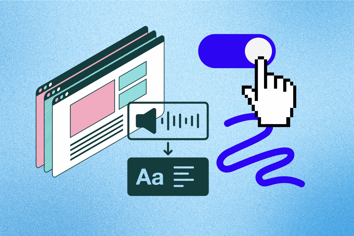
I was on a call recently where someone casually said, “We’ll add accessibility later.” I had to stop myself from dramatically sighing. Because let’s be honest — accessibility isn’t some bonus feature you throw in at the end. It’s just good interface design.
So today, I wanted to share a few practical things I’ve learned while building accessible UIs that don’t look like they were designed by a committee.
Why Most “Accessible” UIs Still Feel Broken
Most teams don’t ignore accessibility because they don’t care. They just treat it like a final checkbox. That’s usually when things start feeling off — interfaces that technically pass audits but still feel cold, clunky, or just… weird.
The 5 Mistakes I See Most Often
After looking at a lot of interfaces, these five problems keep showing up:
| Mistake | Impact | How Common |
|---|---|---|
| Low contrast text | Hard to read for many users | Very High |
| Missing or poor focus states | Keyboard users get lost | High |
| Icons without accessible names | Screen readers can’t interpret them | High |
| Vague link text | click here gives no context | Medium |
| Forms relying only on placeholders | Users don’t know what to enter | Medium |
Fixing just these five issues resolves the majority of accessibility problems on most websites.
Practical Techniques That Actually Look Good
Build Focus States That Feel Intentional
Never remove the focus ring without replacing it. Here’s the pattern I use in almost every project:
:focus-visible {
  outline: 3px solid #6366f1;
  outline-offset: 3px;
  border-radius: 8px;
  transition: outline 0.1s ease;
}

/* Dark mode support */
.dark :focus-visible {
  outline-color: #a5b4fc;
}

/* Optional: Make it look even better on buttons */
button:focus-visible {
  outline-offset: 4px;
}Write Better Form Labels
This one’s simple but surprisingly rare. Here’s how I usually do it:
<label for="email">Email Address</label>
<input
  type="email"
  id="email"
  name="email"
  required
  aria-describedby="email-help"
/>

<small id="email-help">
  We'll never share your email with anyone else.
</small>Design Color Systems That Work in Both Modes
I don’t define colors anymore without checking both light and dark mode. Here’s the minimum system I usually start with:
| Element | Light Mode | Dark Mode | Min Ratio |
|---|---|---|---|
| Primary text | #0f172a | #e2e8f0 | 4.5:1 |
| Secondary text | #475569 | #94a3b8 | 4.5:1 |
| Interactive elements | #4f46e5 | #6366f1 | 3:1 |
| Focus ring | #6366f1 | #a5b4fc | 3:1 |
My Accessibility Checklist (2026 Edition)
Final Thought
I’ve come to realize that accessibility isn’t really about “helping others.” It’s about building interfaces that don’t make anyone feel excluded — including yourself when you’re tired, distracted, or using your phone in bright sunlight.
"When accessibility stops feeling like a constraint and starts feeling like good design, you’ve won.